 Live Canva Design Training!
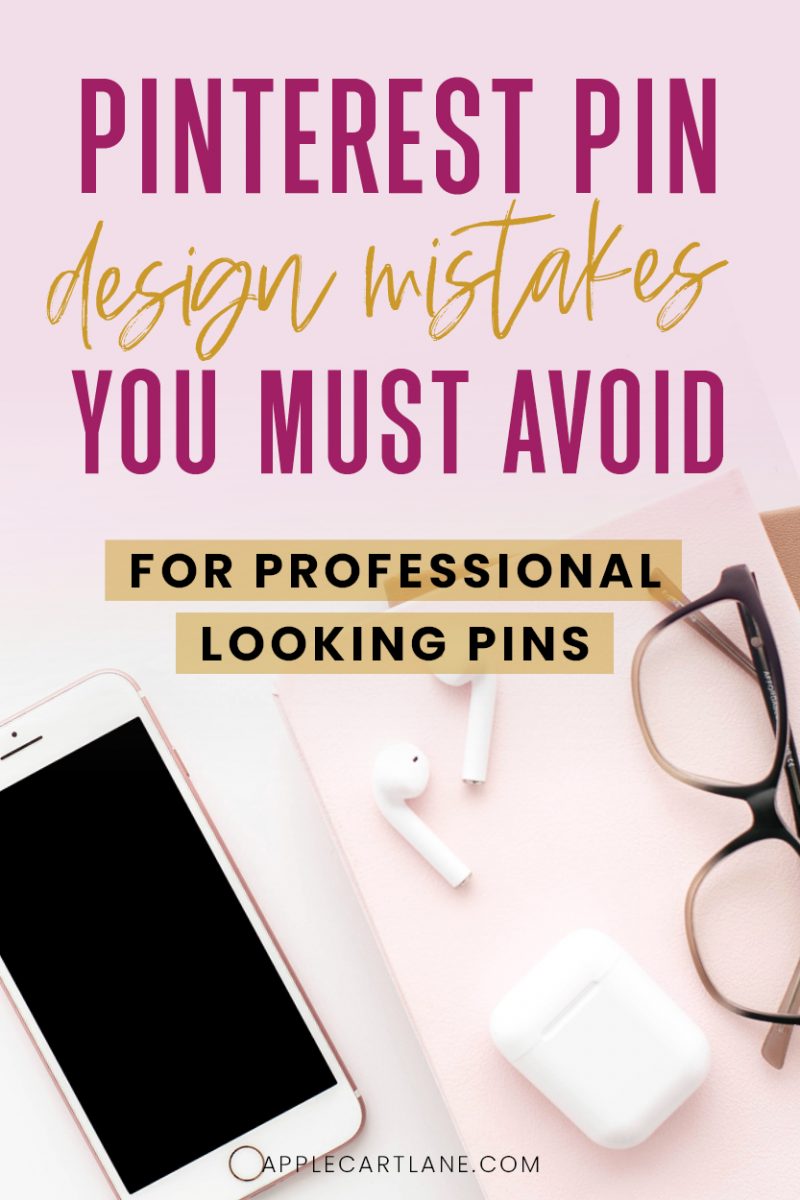 Are you spending WAY too much time trying to figure what in the heck you need to do to actually create a Pinterest pin image that actually looks good?
Creating a standout Pinterest pin image isn’t always the easiest task, but with just a few tips, your pins will be on their way to looking better and better while standing out in the Pinterest feed!
Simple Design Mistakes to Avoid When Designing a Pinterest Pin Image
One of the easiest ways to learn how to design a better Pinterest pin image is to know what NOT to do! I’ve put together 12 Pinterest pin design mistakes that are easy to fix now and avoid in the future. I’m also including quick fixes for each of the mistakes so you know what to do instead!
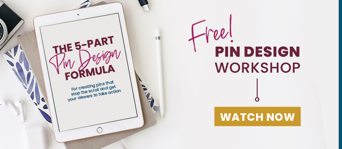
Free Pin Design Workshop
Before we go any further, we need to pause for a second and talk about the actual design of the pins you create. If your pins don’t look good, none of the rest of this matters as much.
I love this element of a Pinterest strategy SO MUCH, that I’ve created a free on-demand Pin Design Workshop just for you!
If you’re ready to go from pin design shame to pin design gain, this training is going to put you on the fast track to creating beautiful pins for all of your content, that actually convert. Click right here to register and the on-demand workshop will be sent to you immediately! (No waiting for a specific time that you can’t commit to.)
Alright, now that you know that your pin design is crucial, and you’ve hopefully signed up for the free workshop, let’s dig in.
Not Enough Contrast
Contrast is a way to create interest and catch someone’s attention. If your pins don’t have that attention-grabbing tendency, your viewers are going to scroll right past. You’ll be lost in the sea of 1000’s of other pins.
You can create contrast within your Pinterest pins in a variety of ways, but the best and most effective contrast combines different size characteristics, shape, color, and space.
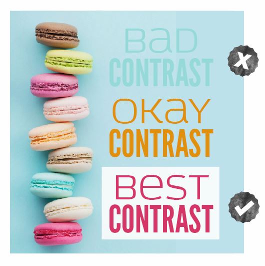
Quick Fix: Try adding a pop of color to something you want to stand out. Make some of your text much larger than the rest. Use a fancy display font among a plain sans serif font. There are so many combinations you can apply to your pins that will stop your viewers dead in their tracks.
Using Script Fonts Incorrectly
So many pins utilize script fonts nowadays, but so many people are misusing them!
If you choose to use a script font in your Pinterest pins, NEVER use them in all caps. They were not intended to be used like this. Also, make sure the spacing between the letters is on-point.
Script fonts are meant to be connected, like cursive handwritten letters. If there is too much space in between the letters, the entire word looks disjointed.
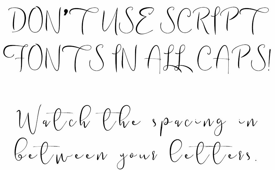
Quick fix: When using a script font, use lowercase letters (unless of course, you need to capitalize for a title or heading) And, watch the spacing between each letter to make sure they are connected as the font usage intends.
For a peek into my super simple and straightforward Pinterest pin design process, be sure to sign up for my free on-demand pin design workshop!
Placing Elements Too Close to The Edge
So many people break this rule! Be mindful of the edge of your document. You don’t want to place text, elements or images (unless you are using an image as an entire background) too close to the edge of your pin. This makes your pin look very unstable as if things are going to start falling off of the edges.
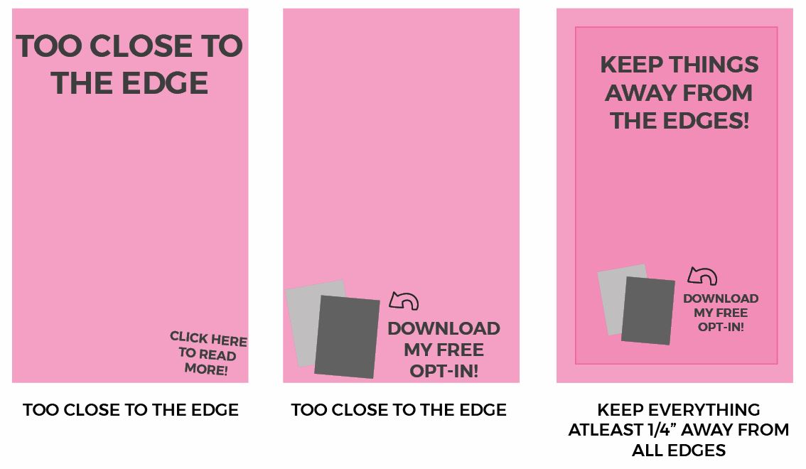
Quick Fix: Keep a 1/4″ margin around all edges of your pins. Unless it is a background image, do not place any element within this safe zone.
Note: Sometimes, text and elements can be intentionally placed off of the edge of a pin or document. Professionals can achieve this. Beginner designers should not attempt this unless they are 110% certain they can pull it off.
Adding Elements Just For the Heck of it
Many pins have unnecessary design elements placed here and there like little bugs on a page. Most of the time, this is because beginner designers feel like they need to add things to make a layout feel “designed”.
The truth is, simpler is better. Don’t just add swirls, shapes or other random elements to take up space or because you feel like your design needs something more.
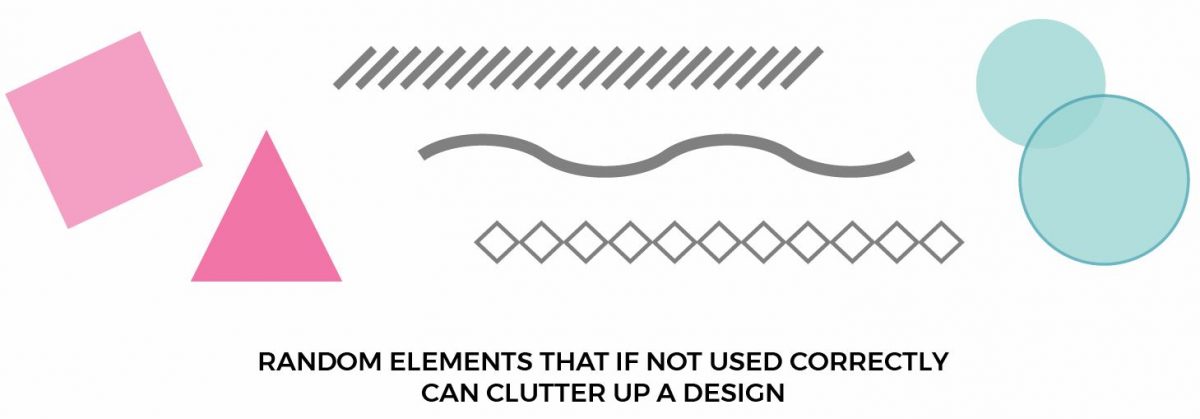
Quick Tip: Keep it simple! Add only the necessities to your pin; you don’t have a ton of space to work with anyways. Essentials include a background image, a title/header, a subheader, a quick call to action and your URL.
The best pins stick with these core elements. Those are the ones that stand out most in the feed. People will look right past a cluttered pin.
Spacing That is Off
Another common Pinterest pin design mistake is when the spacing is off between elements. I see a lot of pins that have the headline split on the top and bottom of the pin in a way that doesn’t make sense.
You have less than a second to catch your viewer’s attention and if they have to even put more than an ounce of thought into reading your pin… Well, they won’t.
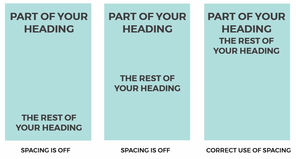
Quick Tip: Keep related text and elements near each other. Unrelated elements are going to need a bit more space between them. This way, your message is much more clear to your viewer. It’s also easier to digest and understand making your pin more likely to be clicked on.
Misaligned Text
This is probably the most common mistake I see on Pinterest. I’d say 40% of pins have alignment issues, mainly with text. Always keep your text aligned to an invisible line down the center, left, or right of all stacked text. Elements placed on horizontally should be aligned to the top, middle or bottom of all elements.
If you are using Canva, it can be hard to keep your text aligned properly because there are no guides that seem usable. Read on for a workaround.
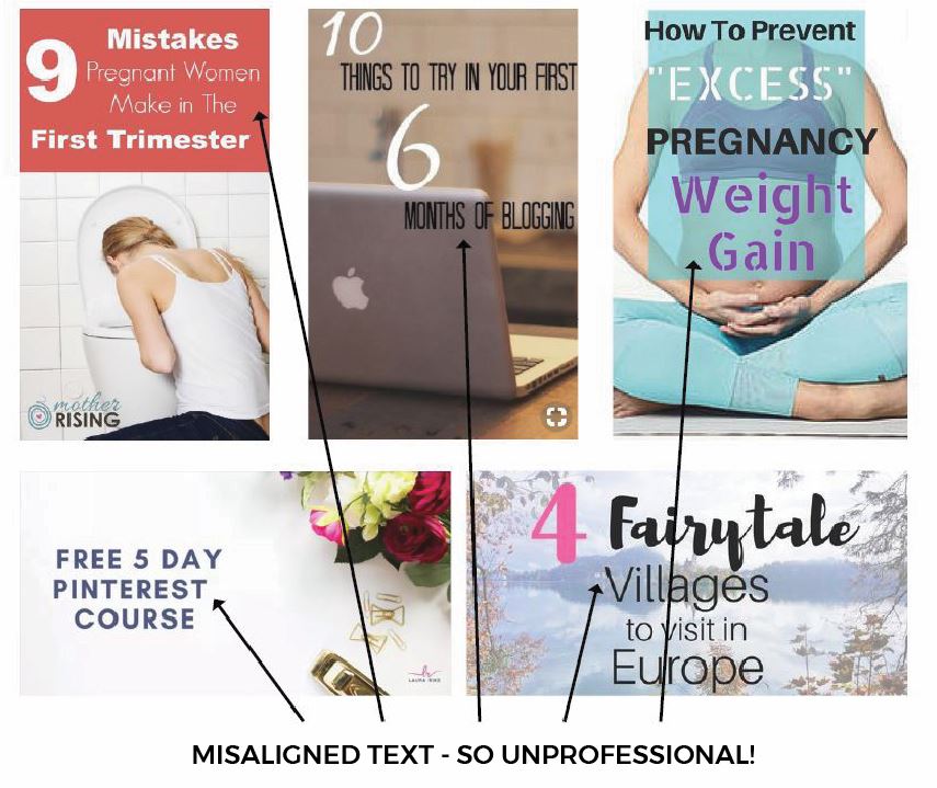
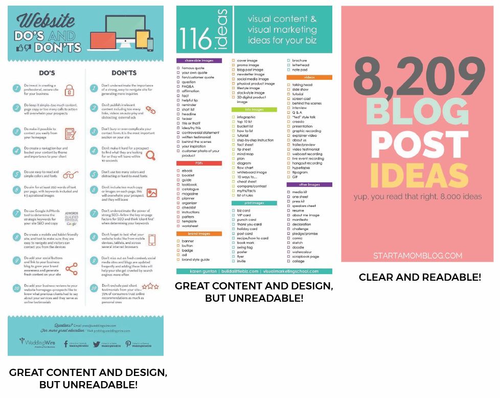
All of the images above could lead to exceptional content, but the images say otherwise. They are sloppy and far from exceptional.
Quick Tip: Temporarily use a line from the element library of Canva to make sure your text or elements are correctly aligned. Keep things aligned to an edge of the document, or to other elements within your layout.
Once you master basic alignment, you can play around with mixed alignment. This is when you have (unrelated) elements aligned differently within your design.
Too Small Fonts
Keep in mind that most people are browsing and pinning on Pinterest from their phones. They’re in the waiting room of a doctor’s office, or if they’re anything like me, they might be hiding from their children in the bathroom on an extended “potty break”.
That being said, make sure your fonts are not only large enough to be read on a small screen but legible as well. Keep your headings large and your subheadings or secondary text big enough to read.
Quick tip: Check out the pin from your own phone, or try reading the pin on your monitor screen from across the room. If you struggle AT ALL to read it, try something else. You want your pins to be quickly and easily read. You don’t want to make people squint their eyes to see what you have to say. They won’t do it.
No Visual Hierarchy
Hierarchy is a design term that basically means making things more important than others within a layout. It’s important because it helps your viewers know where to look first, second and third. Many pins don’t take advantage of this simple design hack that can really help your pins stand out in the feed. Similar to contrast, size, shape, color, and space can help you create hierarchy within your Pinterest pin designs. Especially if you can effectively draw attention to keywords, your audience may be searching for.
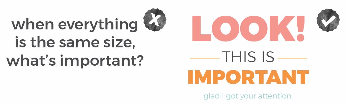
Quick Tip: Before you start designing, assess what you have to work with. What is the most important part of your message? What keywords might someone be searching for that you could put a focus on?
Overused Stock Photos
With all of the free stock photo sites around, it’s not a surprise to see multiple pins with the same image Whatever you do, don’t use these photos even if it’s the last photo on earth. You don’t want to risk looking exactly like someone else.
Quick Tip: Invest in some stock photos if you can afford them. My favorite stock photo sites are PixiStock and IvoryMix. You can also find a large variety of different stock photo bundles at Creative Market.
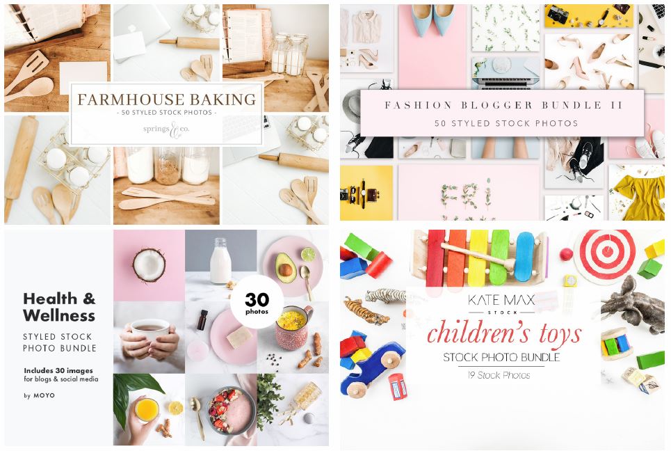
If you can’t afford them just yet, be very choosy with free ones. Don’t settle on the first image you see. Look for images that will convey some emotion within your audience. Just because your post is about travel, doesn’t mean you have to use an image of an airplane. Search for things like “packing list”, “suitcase”, “windy road”, “sunset” etc.
Once you find that perfect stock photo, here are 11 creative ways you can use it!
Bad Color Choices and/or Clashing Colors
Choosing and using colors can be a hit or miss situation when you don’t have any design knowledge about them! Did you know that there is a science behind using and combining them? Different colors evoke different emotions; you want to make sure your pins colors don’t confuse your audience.
Here’s an example: reds are a great color to use for danger, anger and if done right, romance. You’d want to stay away from red if you were designing a pin about organizing or getting a newborn baby to sleep!
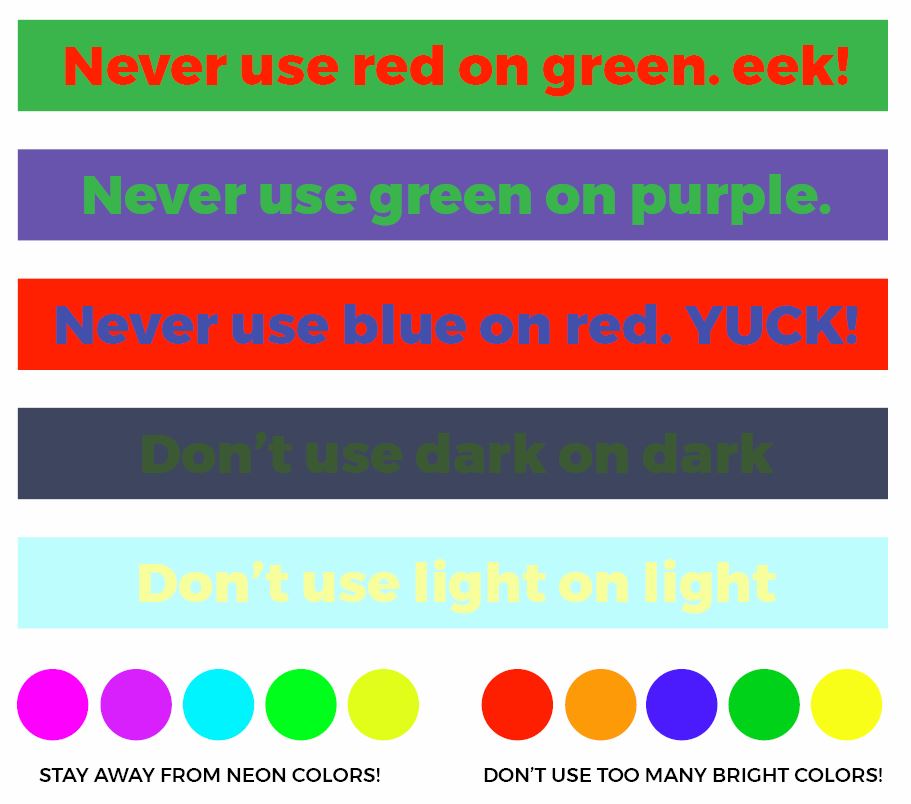
Quick Tip: Play it safe! Familiarize yourself with basic color psychology. There’s an entire lesson on choosing, using and combining colors in The Blogger’s Design Primer.
Use Paletton.com to find complementary colors or a tool like the Colorzilla browser extension to pull specific colors directly from your image.
CTA in the Wrong Spot
You know your pins should have an enticing call-to-action that gets viewers to take action – but where do you put it? Most pinners place it where ever it fits.
Since your CTA holds a tremendous responsibility, it’s important to put it in the most effective place instead. Where is that you ask? It’s in the bottom right corner of your pin. We are trained to skim both text and images in a “Z” pattern, which means the last place your viewer’s eyes hits is that magical bottom right corner.
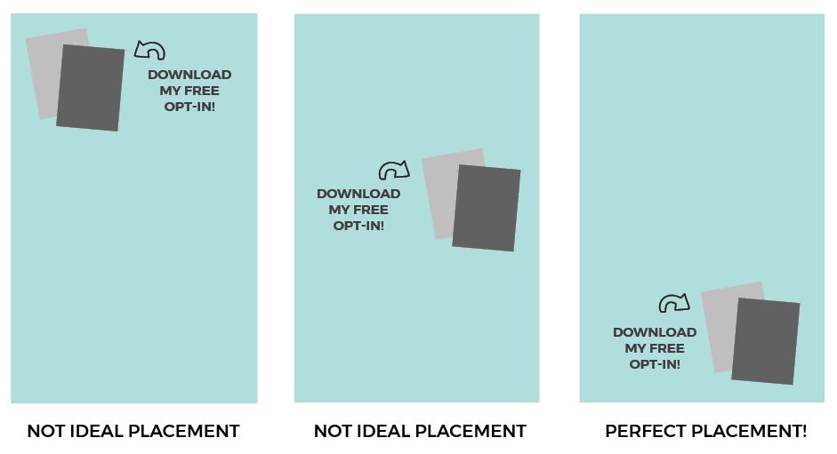
Quick Tip: Keep the last quarter of your Pinterest pin image reserved for any call-to-action you might place there. Invest in a set of pre-designed Pinterest templates that have a designated area for your call-to-action. This will ensure you’re getting your viewers to do exactly what you want them to do at the right moment.
Not Adding Your URL to Your Pin
Should your pins all contain your URL? The short answer is yes. This is a basic step in branding your Pinterest pin images and owning that graphic. Pins get stolen all the time, and you’ll be happy your pin has your URL on it if it happens to you.
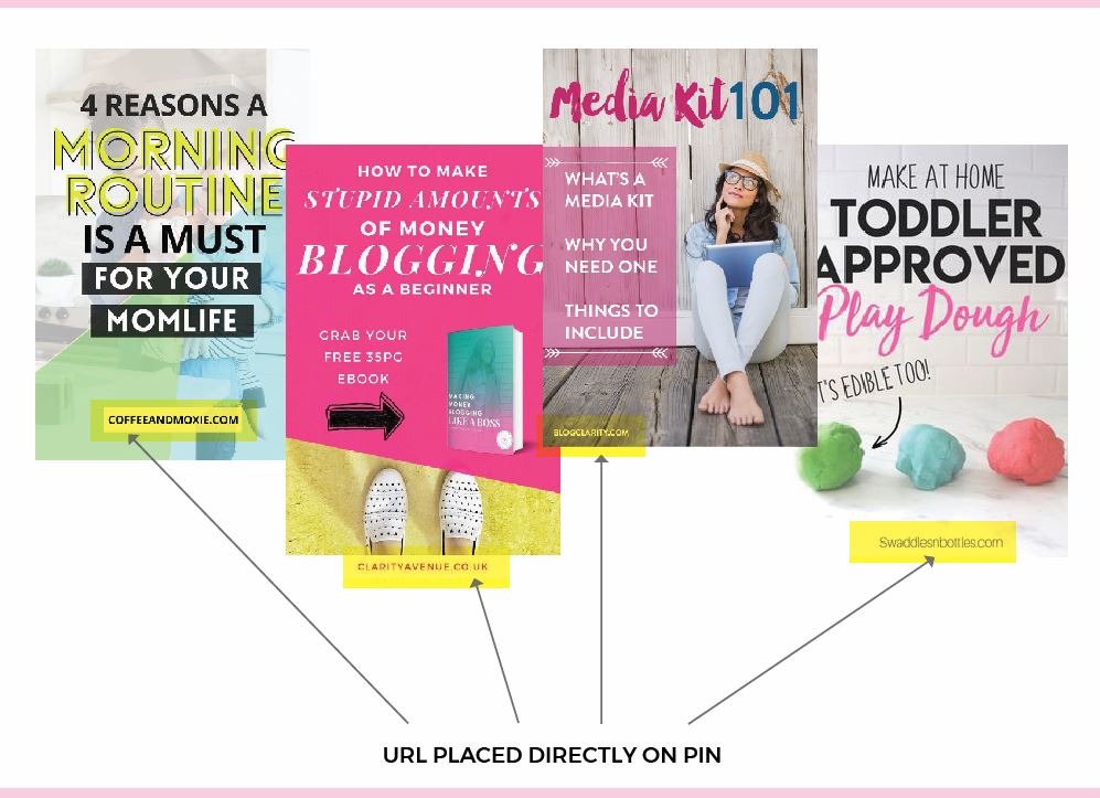
Quick Tip: Again, Pinterest pin templates to the rescue! All of the Pin templates in my shop have a permanent spot for your URL. If you are making your own, don’t forget this crucial detail!
I can’t wait to see what you create, and don’t forget to sign up for my free ON DEMAND Pin Design Workshop, The 5-Part Pin Design Formula!
Thanks for the 12 Mistakes To Avoid For Pins tips. I am going to check my pin images with your helpful tips.
Good luck! Thanks for commenting:)
Love this post, thank you for sharing!! Bookmarked and pinned 🙂
Ugh. I think I’m making all of these mistakes. Great tips that I will put to use as improving on Pinterest is my goal this year. I guess I’ll access your graphic design course for help. Thank you.
We all make mistakes! Just use them as a learning experience to not make again!:)
What perfect timing! I have just started creating my own pins and your post is filled with so many great tips.
Yay! I love when things fall into place!
Thank you! Just what I’ve been looking for….as a new blogger, this is probably my weakest point! Much appreciated.
Wonderful! Happy to help!:)
I’m new to Pinterest so I find this interesting and useful!
Shari-Ann
https://Smarttravelersguide.com
Glad you found it useful!
thanks for the tips and tricks shared.
my mom and sister would love this!
Thanks for these tips. Pinterest is my least used blogging tool but I’m trying to learn more about it so this was helpful.
Happy to help! Pinterest is my #1 traffic source!
Thanks for this article, it’s very helpful to a Pinterest newbie like myself! I really wanted to pin it to my Pinterest board, but I’m not able to. Kind of ironic since this is a post on Pinterest! It may be a glitch with my computer, but in case it’s not and there is an issue on your end, I thought you may want to know. 🙂 I look forward to reading more of your helpful posts!