 Live Canva Design Training!
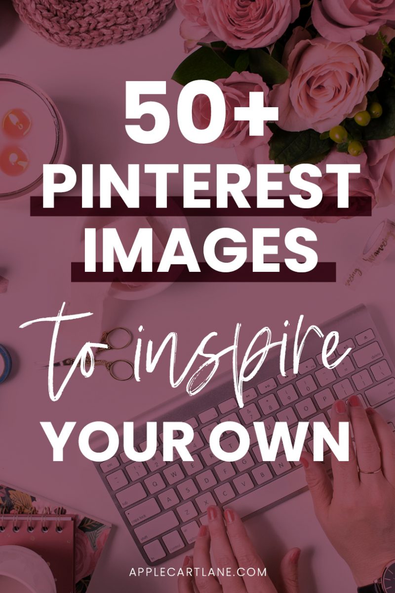 Have you ever opened a blank document to create your next Pinterest pin design and found yourself staring at the screen not knowing where to start?
Oh, the whiteness! It’s so daunting. You really don’t have time to stare at a blank document, do you?
One of the best ways to get started on your next Pinterest pin design is to get inspiration from existing pins that already work.
[disclosure]
A Pinterest Pin Design Hack You Need to Use
I’m not saying to go out and copy the first pin that you see, but there is no shame in using the general layout or design concept, adding your own image, brand fonts, and colors, and making it your own.
Why reinvent the wheel?
I’ve talked a bit about what makes an irresistible Pinterest image and what they can do for your Pinterest strategy, but one thing I haven’t done is shown you many real examples.
I know what looks good because I’m a designer with years of experience, but not everyone has an eye for design.
Before we go ant further, I think it’s safe to assume that if you’re here, you’re looking for some help and inspiration for your next batch of fresh pins. Am I right?
Well, friend, you’re in the right place RIGHT NOW!
I’ve created a free on-demand Pin Design Workshop just for you! If you want to up-level your Pinterest strategy, this training is going to give you so much creative inspiration for creating pins that actually convert.
And you can watch it right now! (No waiting for a specific time that you can’t commit to.)
Alright – back to the show.
I’ve made it a goal to put my Pinterest addiction to good use and start collecting the best Pinterest pin designs I came across. Not only was it fun, but it really made me realize that good pins naturally stand out in the Pinterest feed.
It also made me realize that there are LOTS of ugly pins floating around. Eek!
Okay, let’s cut to the chase and get to the good part…
53 Pinterest Pin Ideas That Work
Although my Pinterest feed is filled with design and marketing related pins, I tried to gather pins from various niches to help you see a variety of good Pinterest pin design examples.
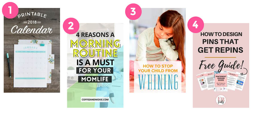
Pinterest Pin Design #1
What I like about this pin: I like how the pin shows the printable in use. It’s actually a photograph but you could recreate this pin by finding a nice background and placing a mock-up of your printable on top. Add a slight drop shadow and you’ve got yourself a beautiful pin!
Pinterest Pin Design #2
What I like about this pin: I love the bright colors used on this pin. I also really like the unique choice of font. The black bars behind a bit of the text adds a bit of contrast that my eyes are drawn to.
Pinterest Pin Design #3
What I like about this pin: Great use of stock photo. The little girl looking down automatically makes you look where she is looking, and that happens to be right at the title of the article. The word “whining” also stands out from the other text, which is good. This is a keyword and it deserves extra attention.
Pinterest Pin Design #4
What I like about this pin: I like the simple font paired with the script font in this pin. LOVE the mock-up placement and how that is displayed. The arrow adds action and you literally can’t help but look at what it is pointing to.
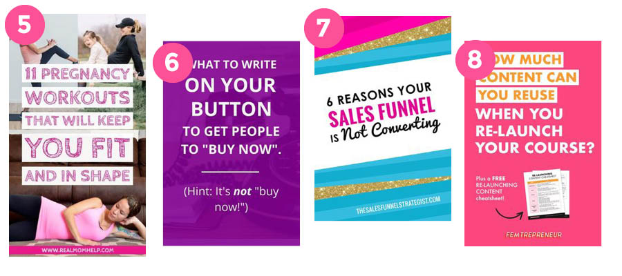
Pinterest Pin Design #5
What I like about this pin: The white bars behind the text really help with the readability of this pin. If they weren’t there, it wouldn’t work. I also like the three images that show a few of the workouts you can expect to find in the full article.
Pinterest Pin Design #6
What I like about this pin: I love its simplicity! Between the solid purple color and the simple sans serif font, this pin jumped off of the screen. Let’s not ignore the slight image in the background that adds just enough interest to the pin.
Pinterest Pin Design #7
What I like about this pin: Um….Glitter. Need I say more? The tilted text is also pretty eye-catching. The emphasis on the keywords “Sales funnel” jump out from the rest of the text making this pin super clickable for anyone searching for that keyword.
Pinterest Pin Design #8
What I like about this pin: The hot pink catches my eye right away! It uses a simple font that is broken up with different colors and, again, white bars behind it. The call to action is displayed nicely and the arrow makes me look at exactly what the blogger wants me to do: click the link, read the article, and subscribe to the mailing list.
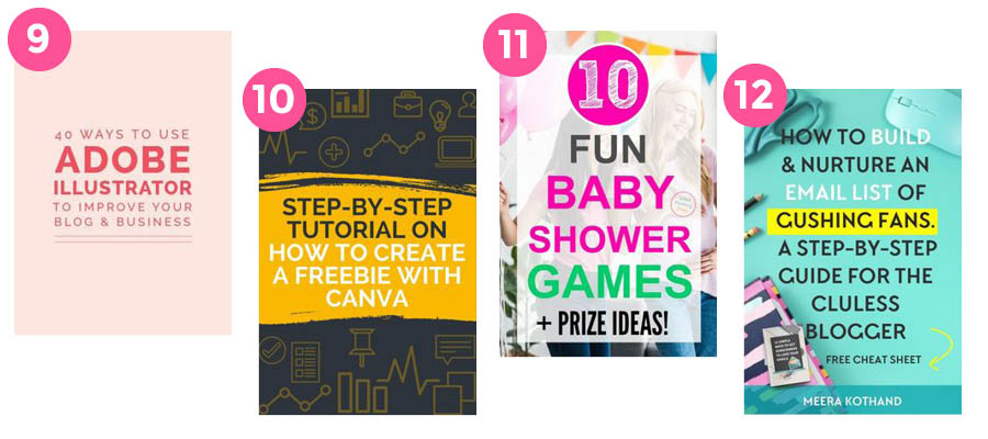
Pinterest Pin Design #9
What I like about this pin: I enjoy the solid background on this pin and the use of a single font. There’s a bit of playfulness going on with the different font weights and sizes. Recreate this by finding a font family with lots of different fonts. Play with the weights to create a simple, yet eye-catching pin.
Pinterest Pin Design #10
What I like about this pin: I’m really digging the dark background of this pin. You don’t see many dark pins, so this pin jumped out at me. Compare that to the bright yellow that is used and you are bound to stop someone in their tracks.
Pinterest Pin Design #11
What I like about this pin: The focus on #10 makes this pin something I’d click on. I already know it’s worth it to me. The light white box helps the text stand out from the busy background image making it readable but still fun.
Pinterest Pin Design #12
What I like about this pin: Even though this pin has a whopping 22 words, my eyes are drawn to the most important ones: build, email list, and crushing fans. That’s all I really need to see to feel compelled to click. Love the mockup of the cheat sheet. Adding a color bar to the bottom makes her name stand out among all of the other text.
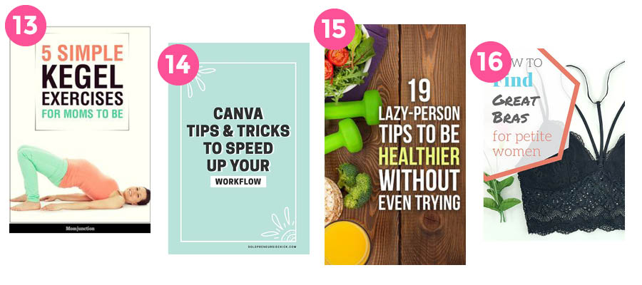
Pinterest Pin Design #13
What I like about this pin: The white space in the image is a perfect area to put a headline! When searching for stock photos, consider how you will use them. Most of your pins will have some amount of text on them so you need to make sure any image you choose can accommodate.
Pinterest Pin Design #14
What I like about this pin: The solid background works well in this pin. I love the dramatic black text with the white peeking out behind it. The little doodles also make the pin feel creative. If you are looking for Canva tricks, those may speak to you.
Pinterest Pin Design #15
What I like about this pin: I’m loving the contrast created by the white text on the dark background! I’m also digging the image choice and how the text balances the food and weights.
Pinterest Pin Design #16
What I like about this pin: Most images are scanned in a “Z” pattern, and this pin puts a focus in that top left corner perfectly. I like the unique use of the hexagon and how there’s a bit of playfulness with the offset.
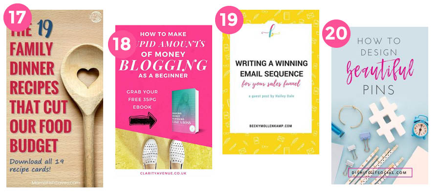
Pinterest Pin Design #17
What I like about this pin: Another great use of stock photography! The spoon itself is big and bold, so that caught my eye first. I can’t help but read the straight to the point, dramatic headline, either! Notice how the text fits ever so perfectly around the spoon? Pin on-point.
Pinterest Pin Design #18
What I like about this pin: The bright colors and the angle of the hot pink shape catch my eye. That shape creates a perfect little nook for the mockup of the eBook.
Pinterest Pin Design #19
What I like about this pin: LOVE the patterned background. I’m not sure why, but the big space at the bottom does something visually for this pin. I think it might help balance the protruding circle shape at the top. Sometimes, when something looks good, you can’t always put your finger on it.
Pinterest Pin Design #20
What I like about this pin: It’s a beautiful pin that is talking about beautiful pins! SoI trust the pin 110% right off the bat. The hot pink jumps off of the light blue background and is used again to encase the URL.
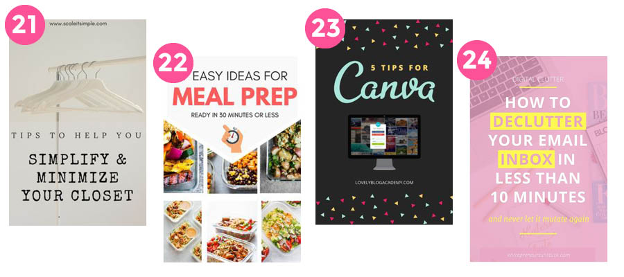
Pinterest Pin Design #21
What I like about this pin: A simple and minimal pin makes sense for an article that speaks about simplifying and minimizing your closet, right? It’s light, airy and the stock image has enough white space for the title of the blog. Nothing about this pin is overwhelming, which would draw in the audience the blogger is looking for.
Pinterest Pin Design #22
What I like about this pin: Loving the chevron shape that points down to the images. I like the 6 images as well, they add a pop of color to the layout. The words “MEAL PREP” in the red helps grab attention since meal prep might be a keyword that a viewer would be searching for.
Pinterest Pin Design #23
What I like about this pin: Black does it again! Since most pins utilize brighter colors, this primarily black pin stopped me in my tracks. The little arrows give it a playful feel, which works. If you’re looking for Canva tips, you’re probably about to get creative.
Pinterest Pin Design #24
What I like about this pin: They yellow and light pink gives an energizing feel that I like. Maybe it’s because I rarely design with yellow. What two words do you read at first glance? “DECLUTTER INBOX”. Those are the only two you really need to see to take action and click on the pin.
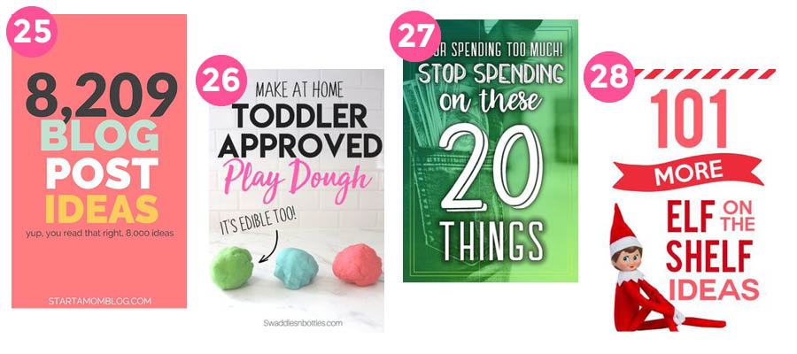
Pinterest Pin Design #25
What I like about this pin: Big, bold, and to the point, startamomblog.com pins are always click-worthy! The huge black number makes it so I can’t help but click. (This is an amazing article if you’re looking for blog post ideas, btw!)
Pinterest Pin Design #26
What I like about this pin: Perfect use of white space. Great use of fonts and interesting enough to intrigue me. I love the little addition of “It’s edible too!” with the arrow pointing to the ball of playdough.
Pinterest Pin Design #27
What I like about this pin: The green overlay over the background image makes a perfect canvas for the article title. The HUGE 20 caught my eye right away too. Not only does it take up most of the pin, but it’s in a funky font that works.
Pinterest Pin Design #28
What I like about this pin: The bright red in this pin catches me off guard. It’s mixed up just enough with the lighter tints used in the title. The red banner is cute too and ads a bit of visual interest. What’s not to love about that cute little elf staring at you?
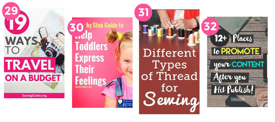
Pinterest Pin Design #29
What I like about this pin: The large pink circle becomes the focal point of this pin that uses a simple background image and blocks of color to help the test stand out. The left-aligned text helps balance the pin out, too.
Pinterest Pin Design #30
What I like about this pin: Balance wins again in this bright pink pin! And, there is just something about that pink and yellow that I like.
Pinterest Pin Design #31
What I like about this pin: Right away, I know this pin is about thread. The image fading into a solid color is a neat way to let your headline shine. A focus is put on the word “sewing” and that helps draw viewers in, who are interested in that topic.
Pinterest Pin Design #32
What I like about this pin: Fun fonts, fun colors, and fun shapes come together to make this pin uber interesting! White text on black is the epitome of contrast and this pin works it well.
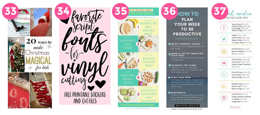
Pinterest Pin Design #33
What I like about this pin: The multiple images draw me in from the get-go. I like pins that show you a sneak peek of the article, but keep in mind, they have to be great images! The gold is also a nice touch in the word “Magical”
Pinterest Pin Design #34
What I like about this pin: First, I love the script font. Second I love how it fills the entire pin. Usually, you want to keep some white space around, but in this case, it’s not necessary. Probably due to the simple black on pink colors going on. Those hearts!
Pinterest Pin Design #35
What I like about this pin: This well-balanced pin probably get’s lots of re-pins because you may not even have to click into the article. I like the colors used and I also like the numbers that go down the center. It keeps the pin aligned creatively. Lots of repetition going on in this pin!
Pinterest Pin Design #36
What I like about this pin: Simple and not at all overwhelming, even though it has a lot of text on it. It’s straight and to the point. Alignment is on point and the light blue works well on the gray background.
Pinterest Pin Design #37
What I like about this pin: Like the last two pins, this pin has a LOT of content but is organized in a way that is not at all overwhelming. The thin lines help break up each section into an easy to digest layout.
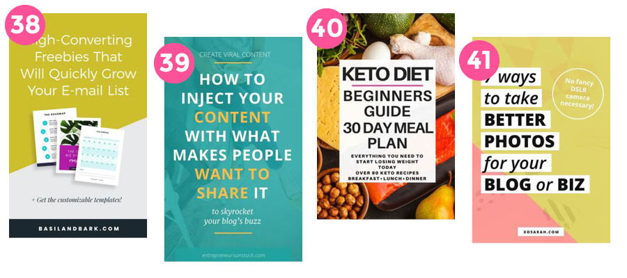
Pinterest Pin Design #39
What I like about this pin: What catches my eye first is the arrangement of the opt-ins laid over the diagonal line in a way that is in perfect balance. I also like the black bar at the bottom that draws your attention to the URL. Brand recognition win!
Pinterest Pin Design #39
What I like about this pin: The blue overlay on top of the image makes a great canvas for the simple white text. Yellow helps the important words pop and the subhead is in an italic font that makes you want to read it.
Pinterest Pin Design #40
What I like about this pin: Loving the super bright background on this pin. If you’re using an image like this, you’ll need to use a technique – like a white box – to make any text readable. Finding the perfect image is sometimes easy, but making it work for you can prove to be a challenge.
Pinterest Pin Design #41
What I like about this pin: I like everything about this pin: the colors, the black on white text, the font itself, the use of italics, and the non-obtrusive circle that holds the call to action placed ever so perfectly in its place.
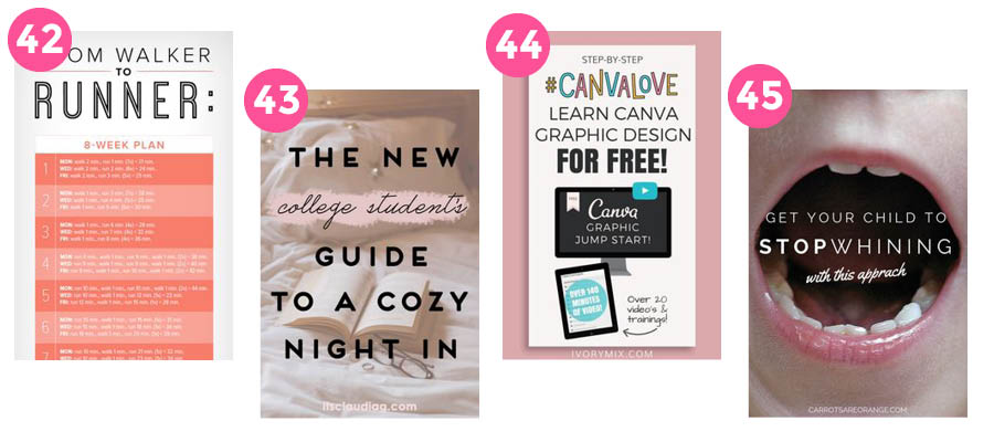
Pinterest Pin Design #42
What I like about this pin: Anyone searching for running will stop dead in their tracks at this pin. A white background gives this pin a clean feel and the alternating colors in the table keep it organized and easy to digest.
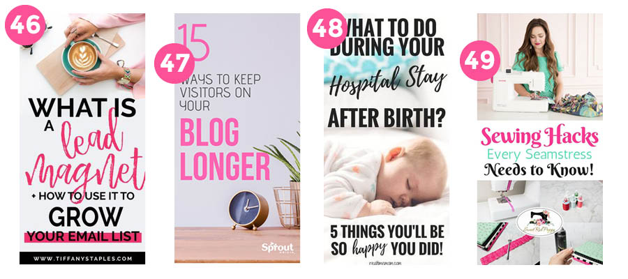
Pinterest Pin Design #43
What I like about this pin: Great use of imagery! The photo looks cozy and makes me want to jump right into that bed. Light pink accents and a cutesy script font also give the pin a warm and fuzzy feel.
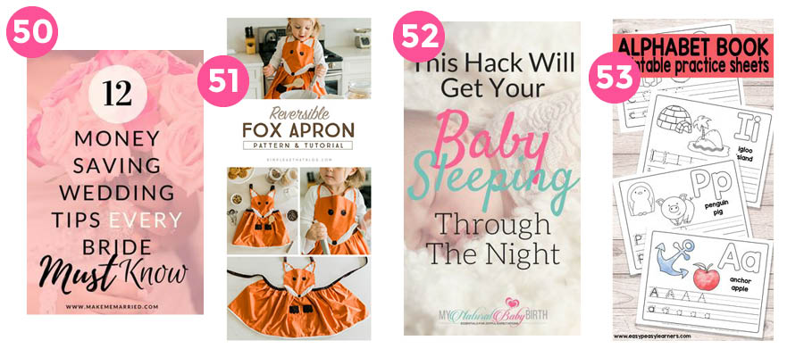
Pinterest Pin Design #44
What I like about this pin: My favorite thing about this pin is the funky colors in the “#CANVALOVE”! I also like the computer and iPad mockups, which are a great way to showcase your digital offering.
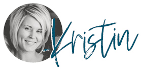
Pinterest Pin Design #45
What I like about this pin: Um, can we say dramatic?! Excellent use of stock photo. Text perfectly placed on the image right where your eyes go first. Very creative!
Pinterest Pin Design #46
What I like about this pin: A fun font in a bright color draws my eyes to the keyword of the pin, “lead magnet”. I also like the pop of color behind the text that pulls the pin together.
Pinterest Pin Design #47
What I like about this pin: Great use of space in this pin. The words ” BLOG LONGER” would be a term that catches my eye.
Pinterest Pin Design #48
What I like about this pin: I enjoy the alternating fonts used in this pin layout. The image breaks up the text nicely, giving it the breathing room it needs to not be overwhelming.
Pinterest Design #49
What I like about this pin: Sometimes it’s hard to design longer pins with the common horizontal photos. I like how this pin managed them by placing the text in between to fill up that space. Colors for the fonts pulled directly from the image give this pin a pretty presentation.
Pinterest Pin Design #50
What I like about this pin: The color is what caught my attention first. That’s probably because viewers are drawn to warm colors like the pink used in this pin. The pretty picture in the background is a nice touch without being too much for
Pinterest Pin Design #51
What I like about this pin: I love seeing the final product in use, not to mention it’s adorable! The arrangement of the images gives the pin a nice balance while providing a space for copy.
Pinterest Pin Design #52
What I like about this pin: Loving the faded background image that is a little blurry as to not distract. The keywords are the main focal point, which is a good trick to catch browsers and make them click.
Pinterest Pin Design #53
What I like about this pin: I love that what you see is what you get in this pin that is specifically promoting a freebie! Creating pins specifically for your freebies is a good way to draw people directly into your email list. Remember, it’s not just blog posts you can make pins for!
Are you Inspired to Create Some Pins?
Phew! You made it to the end! I hope these Pinterest pin designs inspire you to design your own eye-catching pins and help you better understand the key components that make up a great Pinterest pin design.
I can’t wait to see what you create, and don’t forget to sign up for my free ON DEMAND Pin Design Workshop, The 5-Part Pin Design Formula!

This is such a good post to use when deciding on creating pins for Pinterest. I like how you went into detail and said how you liked each one!
Thank you! I hoped that information would help!
These are awesome! Def saving these.
Wow, lots of ideas. This is perfect for me as I’m just starting out with Pinterest.
Thanks for all the great ideas and talking us through why you like each pin. I’ve been feeling in a rut lately creating pins (have basically just been copying old pins), so this was just what I needed to get me motivated to branch out to different designs.
That was my goal exactly, so thank you for commenting!
Thank you for showcasing one of my pins. You always make my heart happy!!!
Aw, thanks Suzi! I love showcasing your work when I can. You’re an inspiration!
Hi Kristen, I loved this post. I’m going to do something like this for a bunch of pins that I’ve deemed myself that I would consider to be “viral” pins. Your post has inspired me to update one of my old posts when I truly didn’t know what a viral pin was. Thanks for this analysis. When I write post I’m absolutely sure that one or two of your pins will be featured in my blog post. Scott