 Live Canva Design Training!
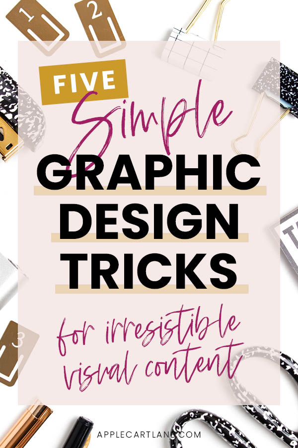 Bloggers are some of the most multi-talented people I know. With all of the daily, weekly, monthly and even yearly tasks that need to happen, you may as well consider yourself an entire marketing team. OF ONE. As a blogger, you’re playing the role of business owner, content creator, content promotor, email marketer, accountant, copywriter and an often overlooked one, the graphic designer.
A graphic designer plays an ESSENTIAL role to any marketing team. When it comes to blogging, you better make sure you’re paying attention to this important role. There are dozens of images, graphics, and other digital assets a blog needs to be successful and the graphic designer is the mind behind making all of them look professional so you can stand out in a crowded space.
[disclosure]
Look Professional with Excellent Blog Design
It’s no secret that if you want to fun a professional blog that keeps people engaged and coming back for more, you need a professional-looking online presence! We live in a visual world, and if your blog graphics look like a 7th grader made them, nobody is going to take you seriously, no matter how good your content is.
You don’t have to be a professionally trained Graphic Designer to produce quality images and graphics for your blog. Today I’m sharing five of the most common graphic design mistakes along with some pro-design tips that have the potential to help bring your blog graphics from drab to fab:
Using Too Many Fonts
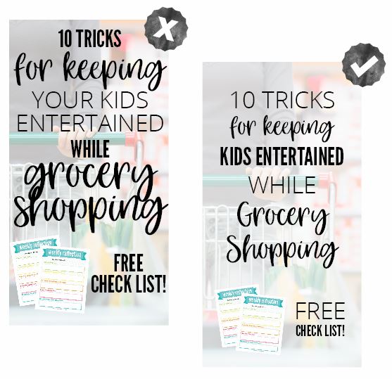
There’s nothing worse than font overload. Whether you are designing your logo, Pinterest pins or that opt-in you know you need to skyrocket your email list, don’t overdo it on fonts. Instead, choose 2-3 fonts to convey your message. With so many fonts to choose from, it’s easy to get carried away and use too many, or even worse, the wrong ones altogether. This mistake can really put a damper on your blog design.
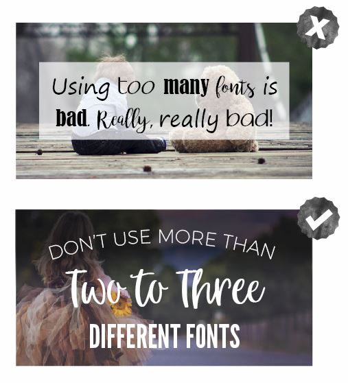
PRO-TIP: To create a little more variety in your designs, choose a font that has some different weights to choose from. I consider any font within a font family a single font.
Hard To Read Text
You’ve searched and searched for the perfect photo to go with your blog article, not don’t ruin it with hard to read text! THere is nothing worse than scrolling along through Pinterest, seeing a graphic that catches your eye and then having to decode what the text says. Make sure ANY text you use on an image, background or pattern is readable! If at first glance you can’t quickly read it, your design needs fixing.
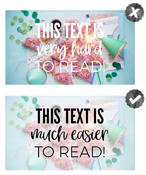
PRO-TIP: If you’ve fallen madly in love with an image but just can’t seem to get your text to work with it, adding a white or black overlay on top of the photo will fix this issue almost every time!
Free Graphic Design Training
If you’re ready to learn some basic design, enroll in my Free 30-Minute Graphic Design Traning to learn some great design tips for creating graphics and visual content for your blog or business. YES, it’s only 30 minutes (cause I know you’re busy!) but you are going to learn SO much! You’ll also get a very brief introduction to six super important graphic design principles that will improve your graphics when you use them.

Bad Color Choices
Failing to consider what colors will work best with your blog design can completely ruin just about any blog image you are working on. It doesn’t matter if it is a promotional image for your course you just launched or a social media image you’re using to promote your latest blog post, choosing the right colors is key to any stellar blog graphic. A lousy color combination has the potential to hurt your eyes and make your readers run far, far away!
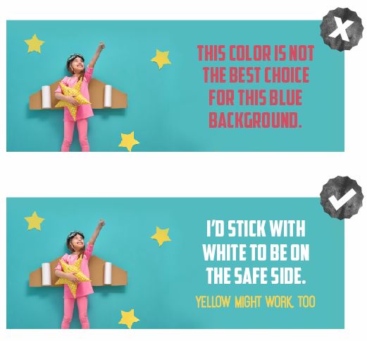
PRO-TIP: Not sure which colors to use with an image? It’s usually safe to pull a color directly from the image to create a cohesive looking design, just be sure to choose a color that will stand out!
Incorrect Use of Spacing
Have you ever been shoulder to shoulder in a group of people? It’s not fun. You like a little space, and you surely don’t want to be uncomfortably bumping bums (or shoulders) with the person next to you. The same thing applies to the images and graphics you create for your blog. Cramming text and elements together results in a cluttered blog design that is hard to connect with and harder to read which means your readers will keep on scrollin’.
PRO-TIP: Make a point to use negative space as part of your design. Leave adequate spacing between lines of text, along the edges of photos and between design elements. Give your designs a little bit of breathing room, and everybody will be happier:)
Failing to Align Your Elements
Have you ever had a kink in your neck? When something in your spine is not aligned, everything seems off. The same thing can happen to your blog graphics when your elements aren’t properly aligned. When your text and elements aren’t aligned, your graphics look messy and unorganized. That is the LAST thing you want people to think about when they interact with your blog. Don’t let this simple blog design fail annoy your readers.
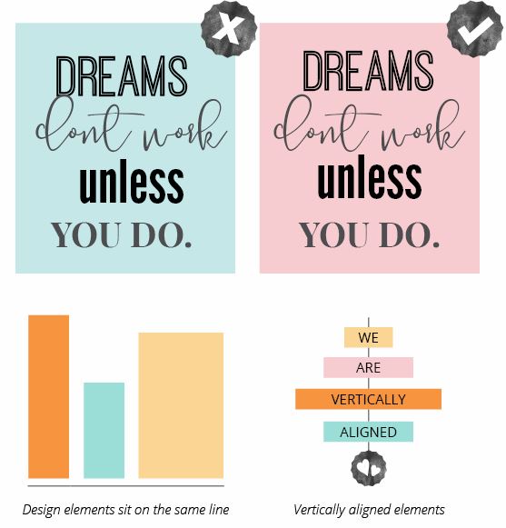
PRO-TIP: To pull off the professional-looking blog graphics you’re striving for and know you need, make sure all written, and visual elements are correctly aligned. Left align, right align or center aligned. Using a grid or imagining a line going through your text helps a ton with alignment. If you’re a non-designer, this is something you’ll want to apply to your design right away.
So there you have it! A handful of tips that you can apply to all of your graphics going forward. I can’t wait to see what you create!

Very class pneumonectomy [URL=https://myhealthincheck.com/melatonin/ – melatonin price walmart[/URL – [URL=https://bhtla.com/product/calcitriol/ – calcitriol best price[/URL – [URL=https://recipiy.com/nizagara/ – 50mg nizagara no rx[/URL – [URL=https://weddingadviceuk.com/product/calcibrook-forte/ – calcibrook forte tablets[/URL – [URL=https://bayridersgroup.com/product/zithromax/ – purchase zithromax[/URL – [URL=https://cassandraplummer.com/drugs/donepezil/ – buying donepezil[/URL – [URL=https://frankfortamerican.com/prednisone-without-rx/ – prednisone on line[/URL – [URL=https://drgranelli.com/fosfomycin/ – fosfomycin cheap[/URL – [URL=https://livinlifepc.com/lowest-price-generic-tadalafil/ – generic tadalafil from canada[/URL – [URL=https://exitfloridakeys.com/item/velpanat/ – velpanat prices[/URL – [URL=https://mrindiagrocers.com/purchase-fildena/ – fildena 100mgg prices[/URL – [URL=https://bhtla.com/product/phenergan-syrup/ – phenergan syrup cost[/URL – [URL=https://endmedicaldebt.com/item/onglyza/ – onglyza online no script[/URL – [URL=https://myhealthincheck.com/drugs/clomipramine/ – cheapest clomipramine buy[/URL – [URL=https://darlenesgiftshop.com/vpxl/ – vpxl[/URL – [URL=https://pureelegance-decor.com/product/edarbyclor/ – edarbyclor[/URL – [URL=https://leadsforweed.com/product/temsujohn/ – temsujohn generic pills[/URL – temsujohn [URL=https://productreviewtheme.org/natdac/ – natdac price[/URL – natdac [URL=https://leadsforweed.com/product/diprolene/ – diprolene[/URL – [URL=https://breathejphotography.com/nizagara-without-dr-prescription-usa/ – nizagara[/URL – [URL=https://breathejphotography.com/product/vidalista-black/ – buying vidalista-black online in australia[/URL – buy vidalista-black austin [URL=https://youngdental.net/drug/risedronate/ – risedronate pills[/URL – [URL=https://classybodyart.com/drugs/uloric/ – buy generic uloric[/URL – [URL=https://ucnewark.com/drugs/pirfenex/ – pirfenex[/URL – [URL=https://exitfloridakeys.com/item/budesonide/ – buy budesonide without prescription[/URL – [URL=https://myhealthincheck.com/anafranil-sr/ – walgreen price for anafranil-sr[/URL – [URL=https://computer-filerecovery.net/item/spiriva/ – spiriva best price[/URL – [URL=https://leadsforweed.com/emflaza/ – emflaza[/URL – [URL=https://endmedicaldebt.com/item/ibrutinib/ – ibrutinib online pharmacy[/URL – [URL=https://oliveogrill.com/item/propecia/ – propecia[/URL – twice-daily melatonin price walmart get calcitriol online in canada nizagara niederlande on line calcibrook forte zithromax capsules pharmacy prices for donepezil donepezil capsules prednisone.com venta de fosfomycin online cheap us tadalafil tadalafil to buy velpanat prices purchase fildena phenergan syrup for sale overnight onglyza buy next day clomipramine uk order vpxl no prescription cheapest edarbyclor dosage price online ordering temsujohn natdac coupon buy diprolene no prescription buying nizagara vidalista black risedronate without a doctor no prescription uloric pirfenex budesonide generic anafranil sr online 1 to 3 days delivery time for spiriva where to buy emflaza online canada ibrutinib online pharmacy propecia price androgen-secreting buttocks specialized https://myhealthincheck.com/melatonin/ https://bhtla.com/product/calcitriol/ https://recipiy.com/nizagara/ https://weddingadviceuk.com/product/calcibrook-forte/ https://bayridersgroup.com/product/zithromax/ https://cassandraplummer.com/drugs/donepezil/ https://frankfortamerican.com/prednisone-without-rx/ https://drgranelli.com/fosfomycin/ https://livinlifepc.com/lowest-price-generic-tadalafil/ https://exitfloridakeys.com/item/velpanat/ https://mrindiagrocers.com/purchase-fildena/ https://bhtla.com/product/phenergan-syrup/ phenergan syrup on line https://endmedicaldebt.com/item/onglyza/ https://myhealthincheck.com/drugs/clomipramine/ https://darlenesgiftshop.com/vpxl/ https://pureelegance-decor.com/product/edarbyclor/ https://leadsforweed.com/product/temsujohn/ https://productreviewtheme.org/natdac/ https://leadsforweed.com/product/diprolene/ https://breathejphotography.com/nizagara-without-dr-prescription-usa/ https://breathejphotography.com/product/vidalista-black/ https://youngdental.net/drug/risedronate/ https://classybodyart.com/drugs/uloric/ https://ucnewark.com/drugs/pirfenex/ https://exitfloridakeys.com/item/budesonide/ https://myhealthincheck.com/anafranil-sr/ https://computer-filerecovery.net/item/spiriva/ india spiriva https://leadsforweed.com/emflaza/ https://endmedicaldebt.com/item/ibrutinib/ https://oliveogrill.com/item/propecia/ accumulate outpatient hyoid 25cm.