Are your Pinterest pins UGLY? You’re not alone! We’ve all fallen victim to creating and publishing pins that we’re not proud of. Spruce up your pins with some helpful Pinterest pin tips in this article where I’m showcasing five real-life Pinterest pin makeovers from bloggers who happily admitted they had some UGLY pins. When I asked my fellow bloggers to submit their ugliest pin for a total makeover, the response was overwhelming!
I picked the ugliest pins to makeover to prove that good Pinterest pin design matters, and to share some helpful Pinterest pin tips along the way. This was an excellent way for me to get to know my ideal audience and show off my epic pin design skills along the way.
Pin Makeover #1
First up is Elizabeth Uchealor from thehomebusinessowner.com. This pin made my eyes hurt! It did have a great headline… but chances are people weren’t stopping to read it.
Here’s where Elizabeth went wrong: The pin has an overall chaotic feeling. Although this is what the article is about – it’s actually the exact opposite of what she wants her audience to feel! Elizabeth wants them to feel calm and organized; like they can kick out chaos.
Pin Design Tip:
Be Although the headline is great, it is tough to read. Be careful when placing text on a busy image. You don’t want to make your viewer try too hard to read your message. Looking at this pin, I also don’t know where to look first. Nothing in the headline stands out and catches my eye. The two styles of graphics (cartoon and black and white illustrated style don’t mesh well, further creating chaos and confusing your viewer. What is going on here? The Makeover + Pin Design Tips: I redesigned the pin with a single image paired with a white gradient. This gave me ample space for the headline. To catch attention and create some interest, I made some of the words bigger in the headline and used a different font.
I also split it into a headline/subhead to make it easier to read and digest. I managed to use the colors from the original pin, in a much less dramatic way. Bright, bold colors are okay – but be careful how you use them, especially when pairing them together.
By toning down the hot pink and using it as an overlay, I was able to use the colors in a much more pleasing way. All of these changes result in a much more visually pleasing image that is easy to read and understand in seconds.
This training is going to put you on the fast track to creating beautiful pins for all of your content, that actually convert. Click right here to register and the on-demand workshop will be sent to you immediately! (No waiting for a specific time that you can’t commit to.)
Pin Makeover #2
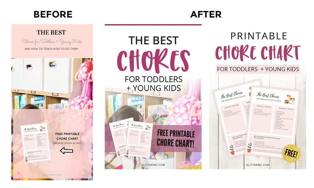
The next pin that I made over was, Lexi’s from Glitter Inc.Lexi’s website is BEAUTIFUL! It is full of crisp and clean images that are beautiful! I love all of the little details and elements. I may have spent like 45 minutes poking around looking for new little surprises.
I can barely read the text on the pin, it’s so small! Many pinners (especially moms, which is her ideal viewer) are browsing Pinterest on their phones when they are waiting at the Dr’s office, relaxing on the couch after the kids are in bed… or hiding in the bathroom. Any text on a pin needs to be readable to catch attention in a matter of seconds. If people can’t read your text…whelp, they won’t even try.
The blocks of pink at the top and bottom split up the pin into three sections that are disconnected. Not a lot of flow happening here. I think there is a little too much text. I am generally big on adding a description, but in this case, she is also showcasing her printable which makes for a pin with too much going on.
The Makeover + Pin Design Tips:
I stuck with the same headline, but really put a focus on the main word, CHORES. Most likely, someone would be searching for something like “toddler chores” or, “chores for kids,” so really highlighting that word will do wonders for the new and improved pin.
I got rid of a bit of the text. Since free printables are the perfect thing to get people to actually click to your blog, I wanted to focus more on that, rather than more text. This is a perfect opportunity to create multiple pins. (Pinterest loves new pins and fresh content!) Another pin may be “How to teach kids to love doing chores” or something like that. She could also create an additional pin just showcasing the chore chart… Which I couldn’t help but do for her. I hope it is bringing her lots of website traffic!
I was shocked that this graphic led to such a lovely laid out landing page. The blue background works on your website, not so much on this pin.
My eyes are instantly drawn to the center of the blue tunnel, which then led me to the ginormous smiling face. I don’t know what to think that that point and it’s pretty overwhelming, so I’ll probably pass on reading whatever text is on the pin.
Is this what her audience is doing too?
The image you choose is SO important. Pinterest is so, so visual that making the wrong choice can make any pin a flop. The background image makes me feel alarmed, and I want to run! 😉The Makeover + Pin Design Tips:
I wanted to create an entirely different feeling with this pin. Pinners like bright, airy graphics, so I went with an image with lots of white space. (I LOVE this kind of image because they make it SO easy to add text to.)
I also switched around the headline and description.
The original pin simply poses a statement that the viewer then has to actually think about. Pinners want to know what’s in it for them right away. In this case, five free email welcome templates. I believe this will result in more clicks.
Instead of using such a bright blue color, I accented the text with a color from the photo. Keep it simple. When you’re offering a digital product, a mock-up works best 99% of the time. It makes the intangible product more “real”, and your viewers will relate much better to this.
Which pin would you click?
P.S. Chantel has SO many awesome FREE resources and products on her website! If you haven’t yet, make sure to pop over and check it out! I’m sure you’ll find something helpful.
I generally like the stock photo choices used in the original pin. Showing the women who are alone hits hard for someone who is doing this motherhood thing alone. I can’t begin to imagine not having my village.
Here’s where she went wrong:
The first thing I see when I look at this pin is “WHAT IF YOU DON’T HAVE ONE?” Have what!?!?
Even though “It takes a village” is at the top of the pin, the focus is on the other text because a. it’s larger, and b. it has more contrast. So you’re asking a redundant question before the viewer is even engaged in your pin.
When designing pins, you want to create a path through your image using what’s called visual hierarchy. It helps your viewer understand what to look at first, second, third, and so on. The visual hierarchy is a bit off in this pin.
The header is also in a slightly offputting font.
That font combined with the red background says danger to me.
Four different fonts are being used in this pin, none of which go together very well. Stick to no more than two to three fonts for any graphic.
There is a block of text that is very very tiny and hard to read. Remember that moms are most likely scrolling Pinterest on their smartphones while waiting at the Dr.s office, relaxing on the couch once their kiddos are in bed, or hiding in the bathroom, taking an extra looooong bathroom break. Is that text readable? Viewers want instant gratification and if they have to work too hard to read your message, they won’t. The Makeover + More Pinterest Pin Tips:
I liked the use of solitary females, but I wanted to find one that attracted moms more (the ideal viewer), so I opted for one with a child. Now, at first glance, we can assume this has something to do with being a mom. (or hiking in the mountains, but you get the idea) The image had a perfect area that I was able to fade out using a gradient overlay and add the text.
What are the main words you’d want someone to see first? I went with “Find your Village” I made it the most significant and boldest text on the pin, so it is the first thing someone sees. It’s right there in their face. I tweaked the headline a bit. Pinners are looking for answers to problems they have. I think adding the “How to” will result in many more clicks.
I got rid of the block of small text. Nobody is going to read that, and it detracts from the overall layout of the pin. Instead, I added a short line “5 tips to make meeting other moms easy”. Again, sharing something they’ll get out of the article.
I pulled a color from the image (little boys sock), so it stood out from the pin while still looking like it belongs. I put it in the lower right corner for a reason. It’s the last thing someone is going to see before they decide to click or not. So if you didn’t catch them with your headline, you have a second chance to pull them in and click!
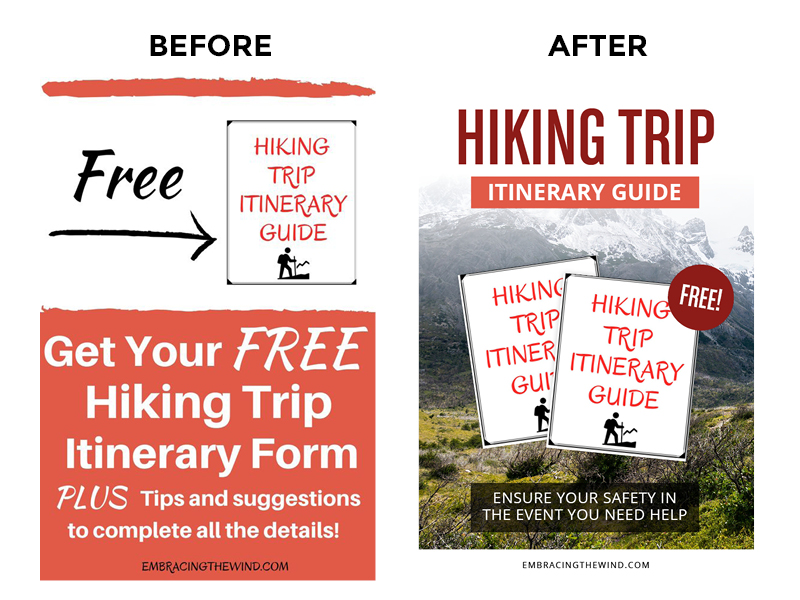
Pin Makeover #5
I LOVE that Angela is making pins that lead directly to her opt-in; that’s a great way to grow your email list!
Everything is fighting for attention in the pin; I don’t know where to look first!
Angela chose the red background to match the text on the mock-up, but it’s a little overwhelming. The color red screams danger, and although dangerous things could happen on a hiking trip, you don’t want your viewers to feel that danger just by looking at your pin.
The red swash at the top of the pin does keep everything contained, but it looks like a blood streak. Eek!
The Makeover + Pin Design Tips:
Instead of using a solid red color for the background, I chose an image that is much more relatable and familiar feeling for someone who hikes.
I accented with the red, and for a little contrast, I chose a darker red to work with.
I chose to draw people in with the words “HIKING TRIP” instead of “FREE”. I’ll bet they are searching for hiking related things on Pinterest, so having these words more prominent will hopefully get more attention (and clicks)!
I layered and angled the guide to give it some visual interest and used a more elegant looking way to show that it is free.
Also, is this a guide or a form? I kept it cohesive, so there’s no confusion.
I added a call to action. (Download Now) Many people simply won’t do what you don’t tell them to!
I rounded it out with another bit of text giving them a little more info about the article… One more reason to click!
Angela loved her new pin so much; she redesigned her opt-in to look much more professional.
I hope you found these pin makeovers and Pinterest pin tips both inspiring and helpful as you create your own pins!
 Live Canva Design Training!
 Are your Pinterest pins UGLY? You’re not alone! We’ve all fallen victim to creating and publishing pins that we’re not proud of. Spruce up your pins with some helpful Pinterest pin tips in this article where I’m showcasing five real-life Pinterest pin makeovers from bloggers who happily admitted they had some UGLY pins. When I asked my fellow bloggers to submit their ugliest pin for a total makeover, the response was overwhelming!
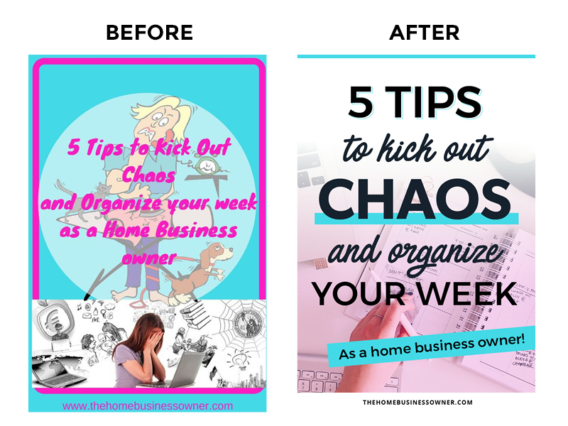 The Makeover + Pin Design Tips: I redesigned the pin with a single image paired with a white gradient. This gave me ample space for the headline. To catch attention and create some interest, I made some of the words bigger in the headline and used a different font.
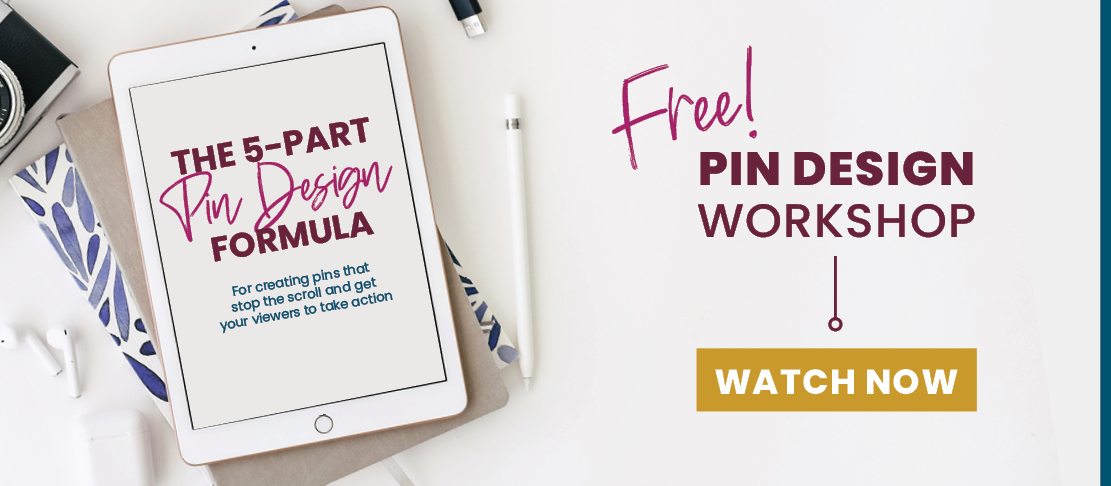
 The Makeover + Pin Design Tips:
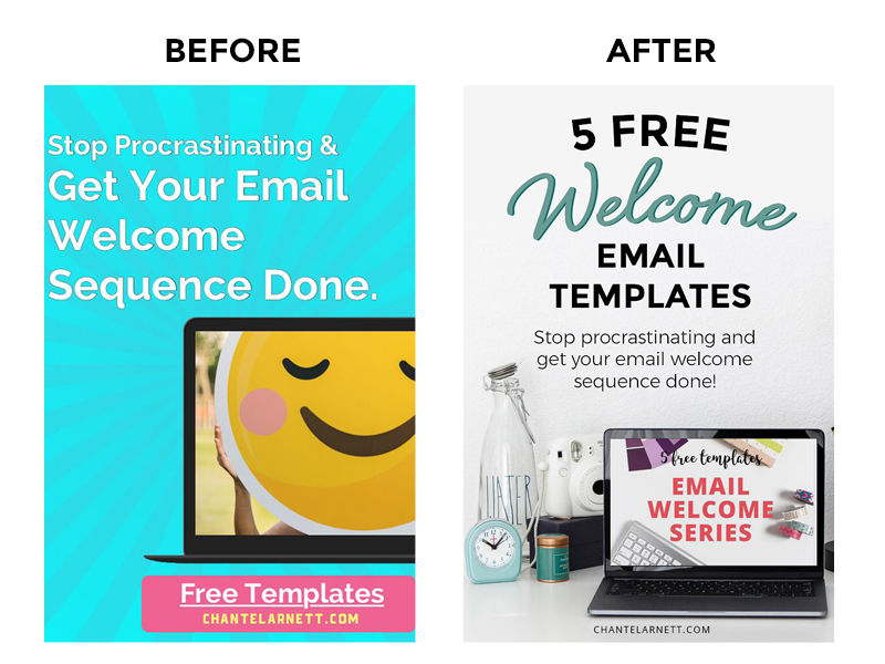 The Makeover + Pin Design Tips:
 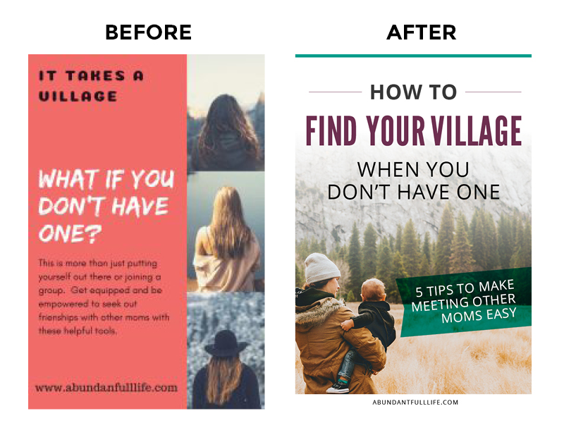 The Makeover + More Pinterest Pin Tips: